User interface
Welcome to this dedicated section of the documentation, focusing on the key aspects of navigation within Integray. It is designed to guide you through each step of the platform's interface. This section covers everything from the initial login process and password changes to leveraging its advanced features. Whether you are just starting with Integray or seeking to enhance your platform experience, we aim to make your journey comfortable and efficient.
Logging in
To access Integray, begin by visiting the login page. There, you'll find fields for inputting your login information. Type in your username and password. The login fields are case-sensitive, paying close attention to uppercase and lowercase letters. It's essential to enter your credentials precisely as they were given to you to ensure successful access. Click here to learn more about the Login screen.
Account settings
To access your Account Settings in Integray, locate your username in the lower-left corner of the interface. Click on your username to open a dropdown menu and select Account Settings.
This action will take you to your account settings, where you can fine-tune various aspects of your Integray account.
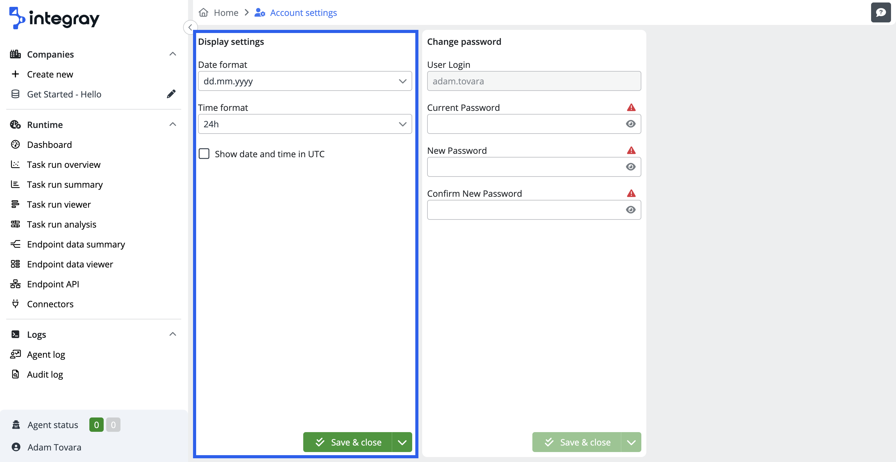
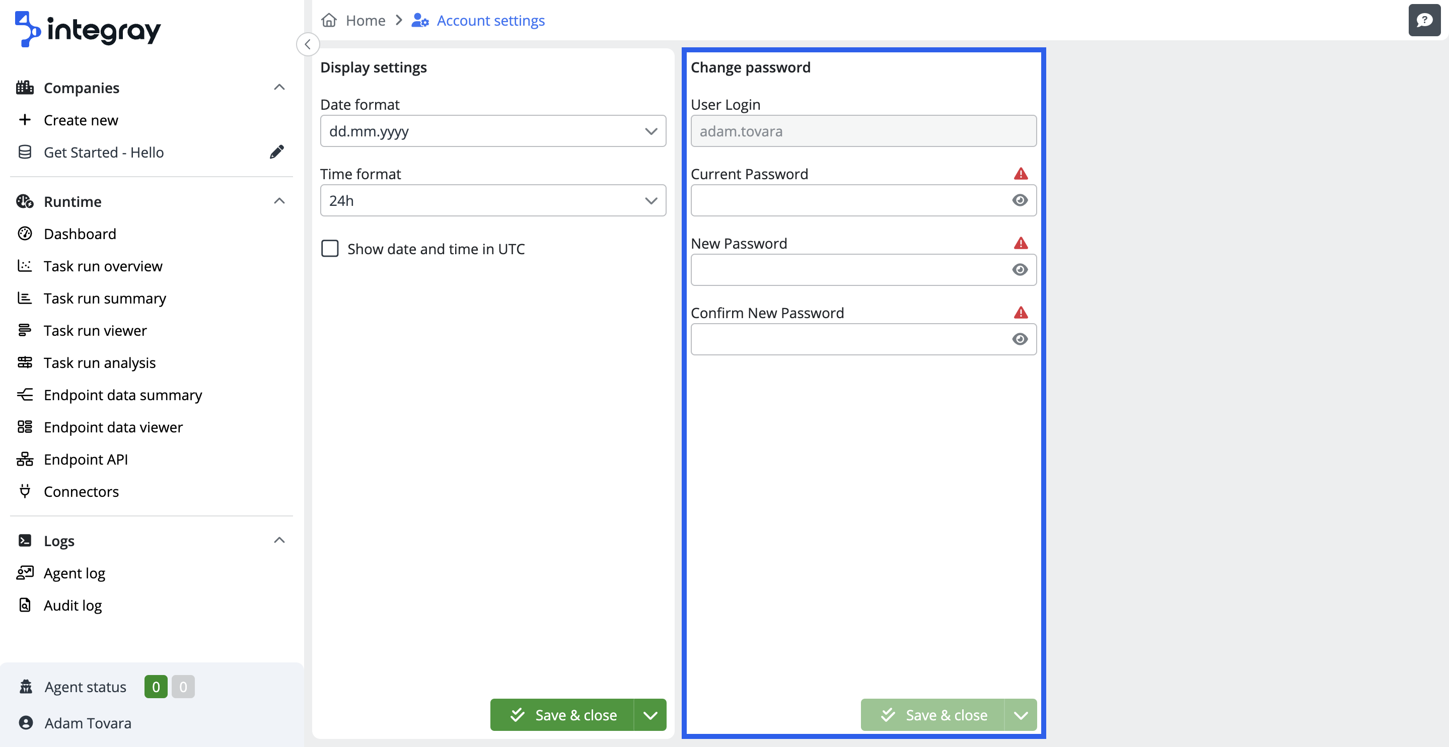
Within the Account Settings, you'll find two sections that enable you to tailor your Integray experience to your preferences. The Display settings section allows you to customize how dates and times are presented within Integray. And the Change password section, where you can manage your account's security by modifying your password.
Display settings
-
Date format: Integray offers multiple date formats, including
dd.mm.yyyy,dd-mm-yyyyandmm/dd/yyyy. This flexibility allows you to pick the format that suits your preference. -
Time format: You can select between a
12-houror24-hourtime format, enabling you to view time entries in the way that makes the most sense to you. -
Show date and time in UTC: You can display date and time information in Coordinated Universal Time (UTC) if needed. This feature ensures precise synchronization and clear communication across time zones.
Change password
-
User login: This field displays your username but is not editable.
-
Current password: Enter your current password when changing your login credentials.
-
New password: In this field, you can input your new password
-
Confirm new password: This field requires you to re-enter your new password for confirmation, ensuring accuracy.
Password field security
For enhanced security, the text in the Current Password, New Password, and Confirm new password fields is sensitive and displayed as asterisks by default. However, you can reveal the text by clicking the eye icon symbol.
Home button
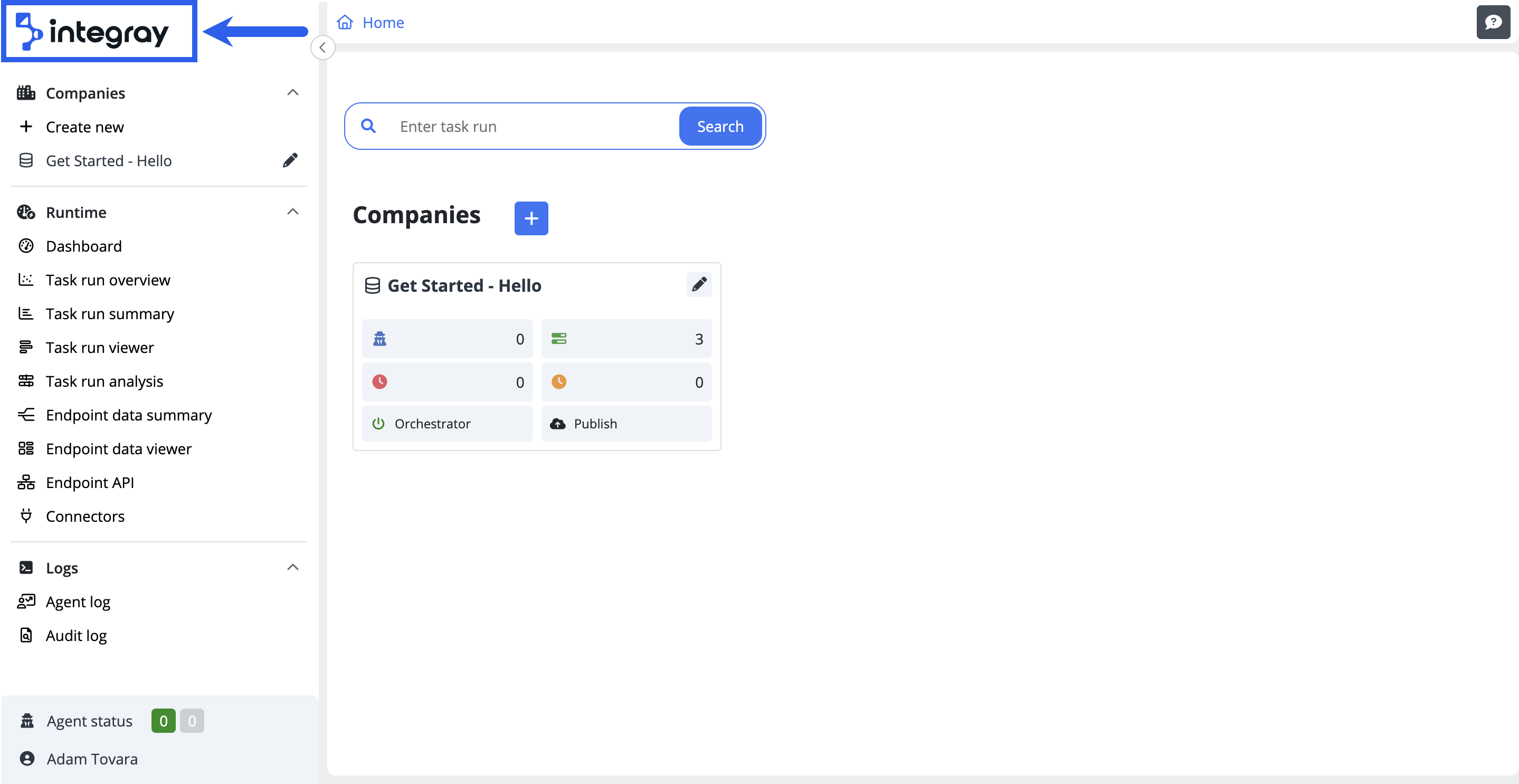
The Home button is located in the upper left corner and integrated into the Integray logo. Its main function is to enable you to return to the home screen. The Home button is constantly accessible, regardless of where you are within the platform. When attempting to leave a page with unsaved changes, an Unsaved changes notification will appear. This ensures that you do not lose any work in progress.
Breadcrumb navigation
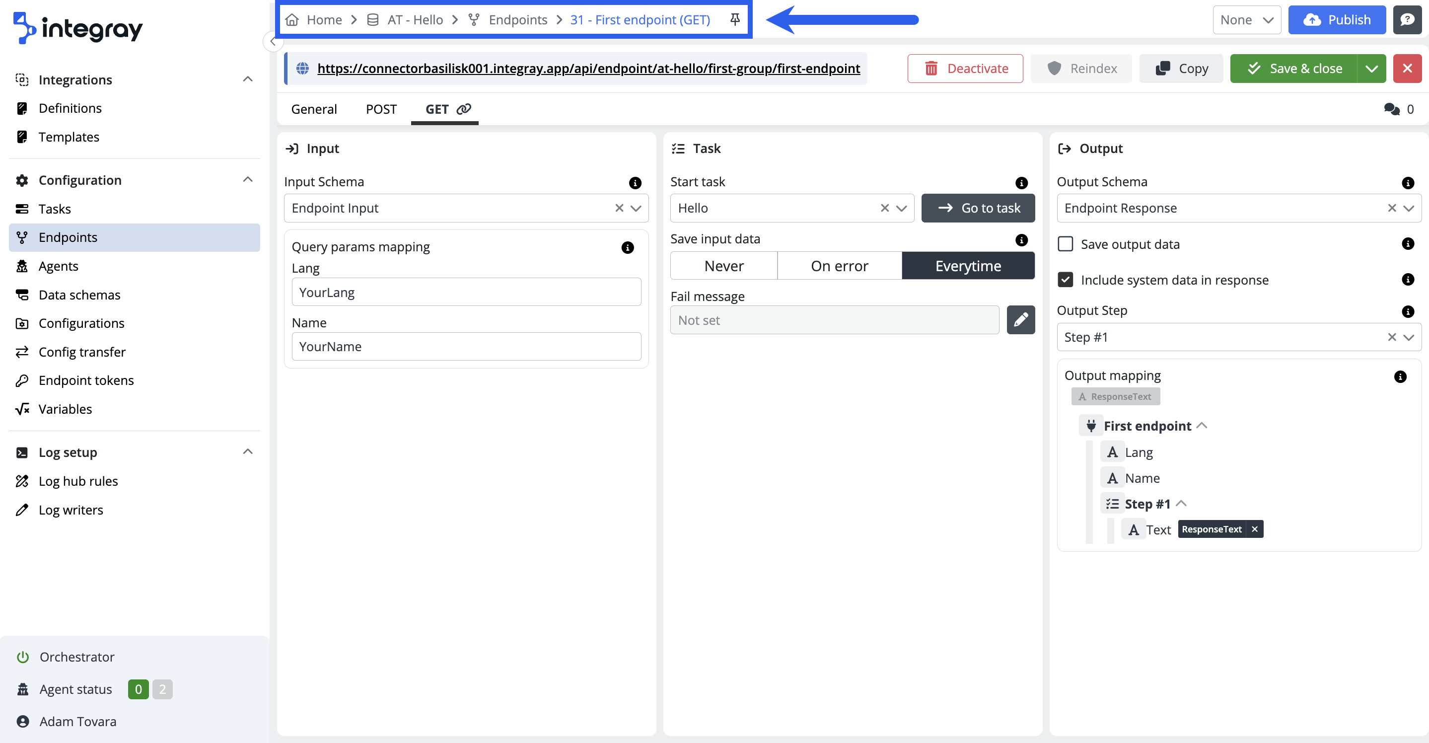
Breadcrumb navigation is a user interface element that helps you to understand your location within a website or application and navigate effectively. It displays a trail of links, representing the path you have taken to reach the current page. This navigation is displayed horizontally at the top of a webpage.
In sections Task, Endpoint, Configurations, and Data Schemas, a pin symbol button may appear at the end of the breadcrumb navigation. This button allows you to select commonly used elements and pin them to the left sidebar, where they will remain visible and easily accessible. Click here to learn more about the Pinning.
Key features:
- Hierarchy-based structure: Breadcrumbs show a hierarchical path from the home page to the current page, indicating each previous page the user has visited.
- Clickable links: Each step in the breadcrumb trail is a clickable link, enabling users to easily return to any previous state or page along the path.
- Efficient navigation: By providing a clear path back to earlier pages, breadcrumbs enhance the user experience by simplifying navigation and reducing the need to use the browser's back button.
Help icons
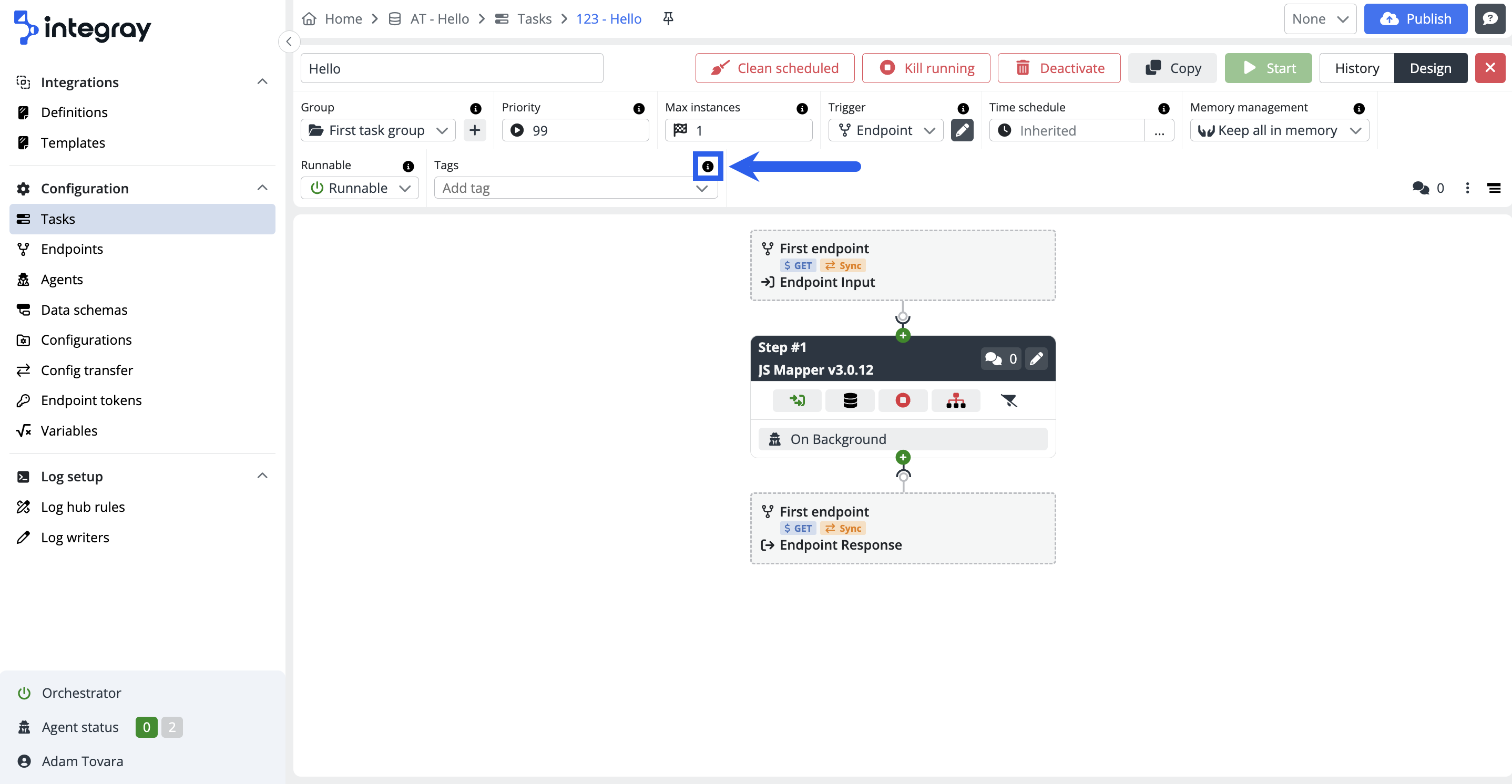
In Integray, most editable fields feature a helpful guidance system to assist you in interacting with the platform. Adjacent to each of these fields, you will notice a small icon marked with the letter "i." This icon serves as a direct link to learn.integray.app, where you can find specific articles offering detailed assistance related to the respective field.
Key features:
-
Enhanced user experience: This feature contributes to a user-friendly interface by providing instant support, making the platform more accessible, especially for new users or those needing a quick reminder of a field's function.
-
Easy access to information: The "i" icon is convenient for accessing relevant help without leaving the current page or interrupting your workflow.
-
Context-specific assistance: Each icon links to an article specifically tailored to the functionality and usage of the specific field, ensuring users receive the most relevant and helpful information.
Preview features
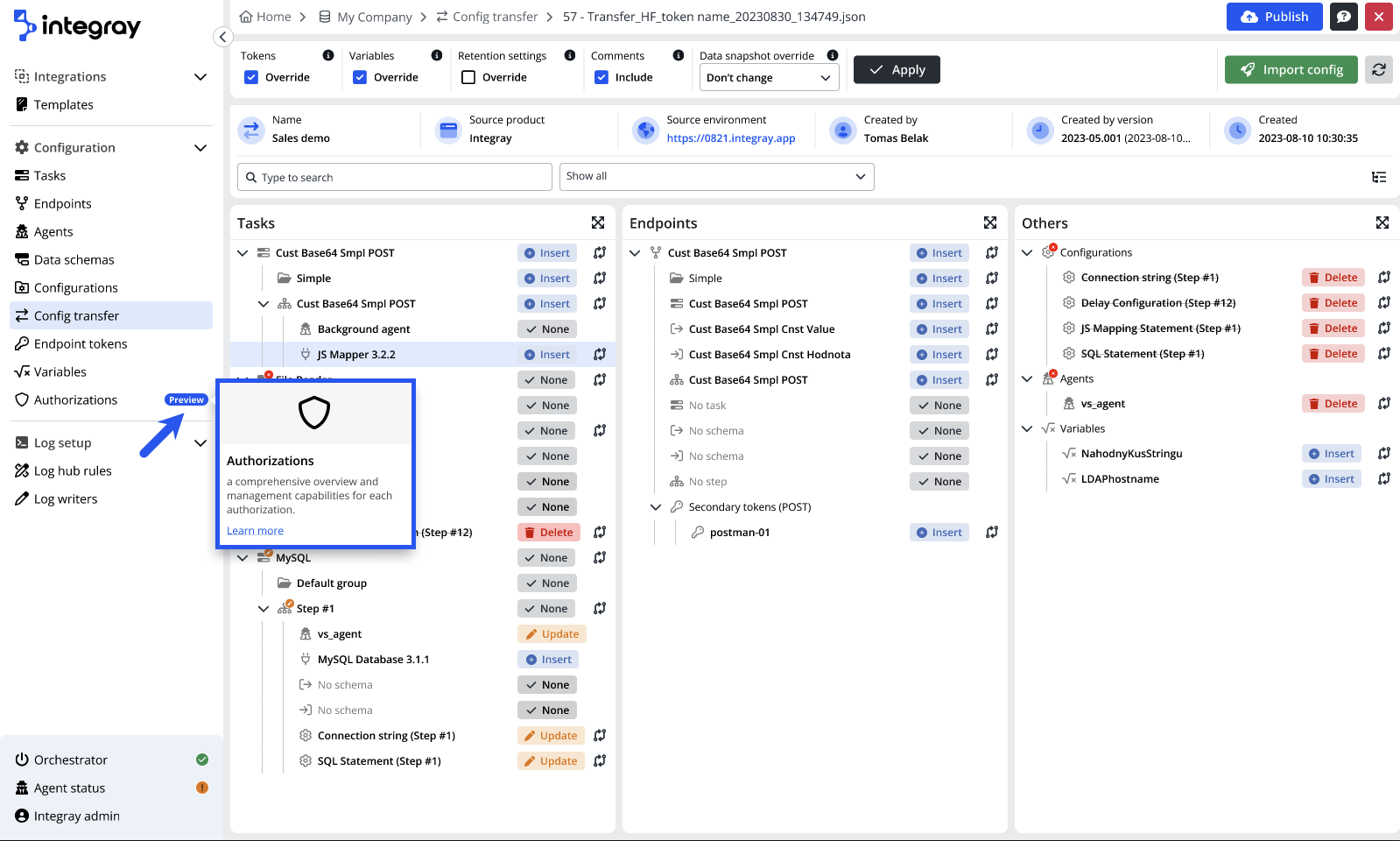
In Integray, we are introducing features with a Preview label. These new features and functionalities are not fully completed but are available for early access. By offering these features, we allow you to try them out and provide feedback.
You can identify the Preview features by a Preview label or icon. When you hover your cursor over the label, a popover will appear, providing additional information and a link to the relevant documentation. Click here to learn more.
Comments
The comments feature is a valuable tool for documenting critical aspects of your configurations, for example, the specific purpose of a Task or an Endpoint. This functionality allows you to capture details, providing context and clarity to your configurations.
Comments option in the platform
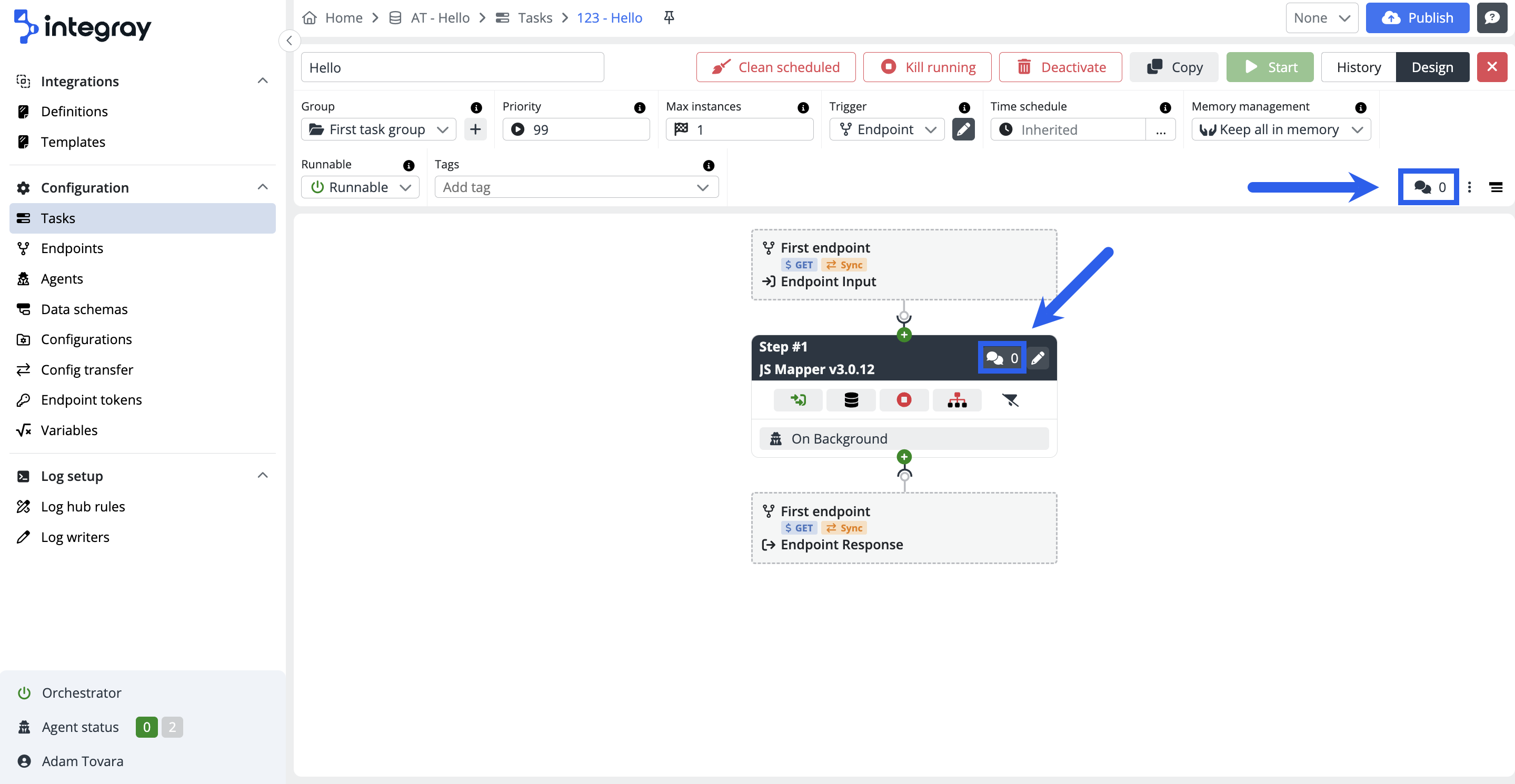
The comments option is used in different parts across the platform to enable meaningful documentation of the integration configurations within the platform. You will find the comments option in the following parts:
- Task
- Task step
- Endpoint
- Configuration
Click on the double bubble icon to enter the comment option. The modal dialog window will be displayed. The comments option works with the rich text editor, i.e., your comments can include formatted text, tables, links, images, etc.
Created comments will be recorded with a timestamp. The author of the comment can edit and or delete the comment.
Tip
Comments can also be included in the Config Transfer.
Grid filters
Grid filters enhance data navigation by allowing filters to be persistently stored and easily managed across multiple sessions and tabs. This functionality is pivotal for maintaining a seamless and personalized user experience.
Storage locations:
- Query string: Filters are encoded in a base64 JSON object and appended to the URL, enabling easy sharing and bookmarking.
- Session storage: Ensures filter preferences are retained during the current browser session.
- Local storage: Allows filter settings to persist across browser sessions, ensuring consistency even after closing and reopening the browser.
Key features:
- Multiple tabs management: Open different tabs with varied filter settings without losing any configurations upon reloading.
- Shareable filter settings: Send a link with your filter settings embedded, allowing others to view the grid as you configured it. The settings persist even after navigating away.
- Last used filter memory: Automatically apply the most recently used filter when opening a new tab, streamlining the user experience across sessions.
Implementation:
Grid filters are applied across all instances where users can instantly filter data by setting values. This functionality is integrated into Task Grids, Task Run History (within the Task Editor), and the Log Viewer in the Task Step Debugger. By preserving filter settings across various interactions with the grid, grid filters offer a seamless and personalized user experience, thereby improving platform navigation and efficiency.


